
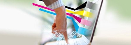
Printed and web design are the two sides of the same coin. There are many similarities between the designers of printed and web materials. But there are many differences as well, which people often do not take into account. Today, the boundaries between printed and web design are almost blurred: the methods and techniques of printing designs play a leading role in the web and vice versa.
#1 How People See the Design
One of the most significant differences is how people use the design. Keeping in hands something tangible – a paper magazine or a book – and interacting with the website in virtual space are two big differences.
Also, there are symbioses, such as electronic journals, which look just like their print counterparts, but are read from the monitor. However, this is rather an exception: printing and web design do have clear boundaries, so the way people see the final design significantly influences all the decisions of its creator. You can visit www.designcontest.com and read the briefs to find out how people see their future designs and what exactly do they want.
#2 How Design Interacts with Senses
Both designs create the appearance of the product and, regardless of the quality of the final product, must make a good impression on the consumer.
In addition to a good visual component, printing products have such an advantage as the tactile effect (texture, shape, and even print effects such as embossing or silk screen printing) while web design uses other interactive elements to attract attention and enliven reading, audio, and video.
Probably, you have noticed that many bibliophiles love the feel of the book, its weight, smell, and texture. These are qualities that cannot be realised in the electronic form.
Electronic books, on the contrary, have advantages that cannot be transferred to the print format: children’s books are full of animated illustrations; electronic versions of scientific literature include links to external sources.
So each approach has its advantages.
#3 The Content of the Form
Most of the sites are constantly changing. For example, news websites: they look differently every day due to new front pages, pictures, and other content. Web design may be modified, altered, or changed at any moment. On the contrary, once passed through the printer, the book or the magazine remains unchanged except for the case when it’s redesigned and printed again.
In contrast to the designers of printed products, who consider the work done after it’s sent to printing, web designers involved in long-term projects since a variety of interactive elements such as buttons, mouse hover effects, forms and surveys need constant attention of the developer. All of these elements must work properly and always stick to one and the same style.
There is no easier way to lose an audience than to miss some design element or to use the element that does not work up to the user’s expectations. Web design is different from the print by its interactive component that requires efforts from the user (click, enter information, download files, etc.).
#4 Usability, or matching the user’s needs
When the design is placed only on the paper, the user’s actions were just about flipping pages. But virtual space is not so trivial. Web designers use a wide variety of menus at the expected location to simplify the navigation so that the user could simply find what they need.
Today, it’s necessary to ensure the correct display of websites in different sizes on a variety of screens, i.e. to use adaptive or responsive design. Moreover, the design has not just to look good but also to be scalable when scrolling and other interactions.
#5 Layout
Almost all elements of both print and web design have requirements to the structure, namely the location of such elements as text, images, shapes, lines, and colour in the layout.
In the printed product, these requirements are dictated by the technical limitations while web designers get virtually unlimited opportunities for information structuring. However, web design also has its limitations like the need for the layout redesign depending on the device size.
#6 DPI and PPI Resolution
The resolution determines the quality of images. We bet you’ve heard the DPI and PPI abbreviations. Most people mistakenly consider them as synonymous, but that is fundamentally wrong.
- DPI originates from the printing process and describes the density of ink dots per inch. In turn, PPI is the number of pixels arranged on the inch of the screen.
The more pixels per inch we have, the more clear and colourful image we see. DPI, in contrast to the PPI, doesn’t intend the change in the image size when printing but affects the quality of the image.
The standard for web design is the size of 72 PPI. However, it will change in the nearest future since modern devices have much higher pixel density.
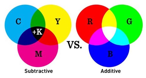
#7 RGB and CMYK colour models
The image on the paper is always different from what we see on the monitor. And this is because the colour on the paper and the screen appears from different colour models. Print products use CMYK colour reproduction model while RGB is used for the web.
If you use both for a single project, the easiest way to bring them to the monotony is to use Pantone matching system to move from one model to another. With the help of Pantone, you can select the equivalent web design colours for printing. Pantone helps to work in a team: clients, designers and printers can be sure that the final product will look exactly like it was intended.
- CMYK is based on 4 main colours used in printing: Cyan, Magenta, Yellow, and Key (black colour). The coding is quite simple and equivalent to the presence of one of the colours in percent: 70/10/0/0 proportion means that in the resulting colour, you’ll have 70% cyan and 10% magenta.
- RGB is based on three colours that you see looking at any monitor: red, green, and blue.
It’s quite difficult to get the same colour on different monitors since each screen has its unique characteristics. Ideally, each monitor must be calibrated (Mac and Windows have special system utilities for this). The encoding of RGB colours occurs by means of three sets of numbers, each of which value can vary from 0 to 255.
P.S. RGB colour space contains more colour than CMYK, so some designers make their models in RGB to achieve greater colour gamut. However, all these actions have no meaning.
#8 Changes in the Project
AS a rule, the role of web designers is rather limited. They just create the initial version of the design while user reshapes and changes it up to his needs, using a variety of screens, interacting with the interface, or even changing the fonts and their sizes in the browser settings.
In the printed products, the satiation is quite the opposite: the designer has complete control over the project until the release. The user can’t influence the printed design, so the printers need to take smart decisions about the final form of the product. The designer has more control over the current project and can make essential changes.

Regardless of the approach to the both types of design, they are still the two sides of the same coin. And hardly ever any company can avoid any of them. The understanding of the basics will help you to promote your brand through all available channels.
Article written for Graphics Bite by Brian Jens at Design Contest